HTML Forms: Form Elements
An HTML form supports different types of input elements for getting input from the user. These types are text, password, and input types, checkbox, radio etc. To get us acquainted better, let us begin with by providing a list of these form elements. These are input options present in HTML4. In fact, HTML5 adds a lot more newer input options. Since the scope of this module is HTML4, we do not cover them here.
| Form Element | Input-Type | Description |
|---|---|---|
| Single line of Text | text | To add one line of text |
| Password | password | For security, the input password text is shown as asterisk |
| Radio selection | radio | Radio-style single selection from a set |
| Checkbox selection | checkbox | Checkbox-style selection of one or more values from a set |
| Select (for List) | select | Selecting (one or more) from a list of options |
| Submit button | submit | Button to send the form data to the web-server |
The text input type allow us to add text into the form. Sometimes, we may want to enter a lot more text and for that HTML provides a cousin element of the text type: textarea. The textarea element does not sit with the input element and has its own tags: <textarea> and </textarea> -- that is why we do not add that to the above table. The textarea tag has several attributes like row to specify the number of rows, cols to specify the column length in characters, readonly to not allow editing the value etc. Next, the password type also accepts alphanumeric inputs. However, when a user types in the password field, then the input is not displayed; instead, for the sake of security, it displays each character as an asterisk!
The next input type in the above table is the radio button. This input enables us to select a single option from a list of options. For this to be the case and similar to that of a checkbox, all radio buttons belonging to one list, should have the same name. Once again, to distinguish various radio buttons that belong to a list, we need to assign different values to them. Radio buttons allow us to toggle between various values. In other words, if we select an option then the earlier selected option (if any) would be unselected.
The next input element in the above table is the checkbox element and it allows selection of one or more options from a list. Each option of the checkbox list needs to have the same name but should have different values. If different checkbox inputs have the same value, then when we send the user-input to the server, the server cannot distinguish the option (or options) that the user selected. One special case is when we do not provide any value to the checkbox options. If such option is selected, then HTML assigns a default value of "on" to that option.
The next input type in the above table is that of select. With "select", the list appears as a pull-down menu on the browser. Like the checkbox input type, a select box can also allow multiple selection!
By default, the select allows us to select only one value. However, if we wanted to select multiple values, then we can simply add the multiple attribute as in: <select name="planets" multiple>. The purpose of that attribute is to specify that the user may select multiple values. The multiple attribute is a boolean attribute and we can also specify it as: <select name="planets" multiple="multiple">.
The last guy in the above table is the submit type. This is a button type and when a user clicks this button, the input from this form is forwarded to the server.
HTML forms also have additional elements. We show two of them in the following table.
| Form Element | Input-Type | Description |
|---|---|---|
| Grouping | fieldset | Groups similar input types into one visual group |
| Legend for Grouping | legend | Adds comments for fieldset. Improves readability for non-visual media |
We can use the fieldset option to visually group a list of similar input element together. The legend option helps us provide a common caption to the fieldset elements -- it helps accessibility when users access it using a non-visual reader.
After describing these elements, we provide below two examples to demonstrate their role. These examples attempt to select both a single value from a set and to select multiple values from a set. For that, the first example uses radio for doing single-selection and checkbox for multiple selection. The second example uses the select element for both single-selection as well as multiple selection.
This first example focuses on using radio elements and checkbox elements. For both of these elements, we use the fieldset element to club together similar options. For a script, the location and the method where the user-input is forwarded depends upon two attributes of the form element: action and method. The action attribute accepts the name of a server-side file and it is this file that accepts and processes the form data. In our example, we keep it as "addInfoMoon.php". For the sake of example, we keep the server file as a PHP file in the action parameter; the file could be executables of other types as well, like Python, ASP, etc. The method attribute specifies the style of sending data and can be either POST or GET; if the method is not specified, then as per W3C, the default method is the GET method. Here is the example:
 <!doctype html>
 <html>
 <head>
     <title> Add Info about Moons </title>
 </head>
 <body>
 <h4>Form to Add Info about Moons</h4>

 <form name="inputMoonInfoForm" method="POST" action="addInfoMoon.php">
     Moon Name:
     <input type="text" name="textMoonName"><br><br>

     <fieldset>
     <legend> Select the Planet </legend>
         <input type="radio" name="planet" value="earth"> Earth
         <input type="radio" name="planet" value="mars">   Mars
         <input type="radio" name="planet" value="jupiter"> Jupiter
         <input type="radio" name="planet" value="saturn"> Saturn
         <input type="radio" name="planet" value="uranus"> Uranus
         <input type="radio" name="planet" value="neptune"> Neptune
     </fieldset><br>

     <fieldset>
     <legend> Select (one or more) Characteristics of moons </legend>
         <input type="checkbox" name="properties" value="propertyAtmosphere"> Has atmosphere
         <input type="checkbox" name="properties" value="propertyWater"> Has Water
         <input type="checkbox" name="properties" value="propertyVolcanoes"> Has Volcanoes
         <input type="checkbox" name="properties" value="propertyCrater"> Has Crater
     </fieldset>

     <br>Notes on the Moon:
     <textarea name="textareaDescription" rows="2" cols="25">Notes on moon</textarea>
     <br><br><br>
     <input type="submit" name="submitButton" value="Add Moon Info">
 </form>
 </body>
 </html>
If we load the above page, we would see the following output.
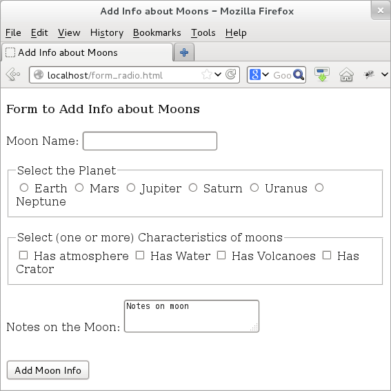
Figure: HTML Forms: Radio Element
Now, let us rewrite the same above example, but this time using the select element. By default, the select element allows us to choose only a single option from the list. When designing the structure for doing multiple selection, all we need to do is add the multiple attribute to the select option.
 <!doctype html>
 <html>
 <head>
     <title> Add Info about Moons </title>
 </head>
 <body>
 <h4>Form to Add Info about Moons</h4>

 <form name="inputMoonInfoForm" method="POST" action="addInfoMoon.php">
     Moon Name:
     <input type="text" name="textMoonName"><br><br>

     Select the Planet:
     <select name="planet">
         <option value="earth"> Earth </option>
         <option value="mars">  Mars</option>
         <option value="jupiter"> Jupiter </option>
         <option value="saturn">  Saturn </option>
         <option value="uranus">  Uranus </option>
         <option value="neptune"> Neptune </option>
     </select><br><br>

     <fieldset>
     <legend> Select (one or more) Characteristics of moons </legend>
         <select name="properties" multiple="multiple">
             <option value="propertyAtmosphere"> Has Atmosphere </option>
             <option value="propertyWater">  Has Water </option>
             <option value="propertyVolcanoes"> Has Active Volcanoes </option>
             <option value="propertyCrater">  Has Craters </option>
         </select>
     </fieldset>

     <br>Notes on the Moon:
     <textarea name="textareaDescription" rows="2" cols="25">Notes on moon</textarea>
     <br><br><br>
     <input type="submit" name="submitButton" value="Add Moon Info">
 </form>
 </body>
 </html>
If we load the above page, we would see an output similar to that of the earlier form. It is worth noting that even though for both types of selection -- single and multiple -- we rely on the select element, the browser renders them differently.
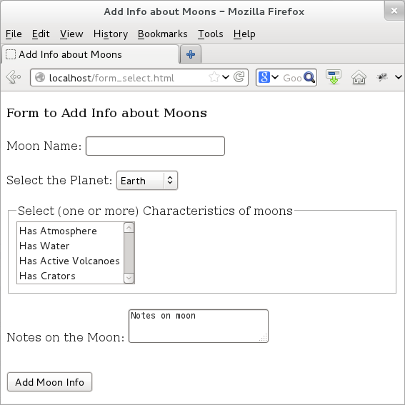
Figure: HTML Forms: Select Element