Layout and Positioning: Float and Clear
A browser has a default behavior when preparing a layout. This behavior depends upon the type of element, whether it is a block type element or an inline type element. Blocks are displayed from top to bottom. Inline elements are displayed from left to right. When it reaches the end of the right, the browser will add a new line and start the remaining content from the left on the new line. For more on block and inline elements, please visit our HTML section: HTML Element Types.
This page focuses on two CSS properties that help us with layout: float and clear.
Using float
In "normal" view, each block element would occupy the entire-width of the browser-window. But, we would see soon that this does not apply to blocking elements that are floating. When using the float property, a block element can also be arranged in the left to right fashion. The float property often works with the clear property, where we specify that the following element (or elements) should add more space, if the float would end up occupying more height.
Before we go further, let us start by looking at the float property in more detail.
Usage: float: [left | right | none] | inherit;
Description: Allows a block element to be placed as a float. With the float property, the box of a text-based element floats like an image on the page. The values "left" and "right" instruct the browser to float the element on the left or on the right, respectively. We can use float to create multi-column layouts and one way of doing that is to specify individual width to each column. Please note that it is not mandatory to specify the width value when using a float.
Example: Specifying "float: left" would float an element on the left side.
Example: Specifying "float: right" would float an element on the right side.
Let us understand the usage of the float using an example. In this example (provided below), the HTML page has two divs in the body element. The goal here is to float the first div on the right side.
 <!doctype html>
 <html>
 <head>
     <title> Page Layout (Without Float) </title>
 </head>

 <body>
 <div id="id_evolution">
 <h2>Timeline of Dinosaur Evolution</h2>
 <p> Our earth is 4.54 billion years old and the first life on earth started around 3.8
 billion years ago. The age of dinosaurs and reptiles began about 225 million years
 ago. They dominated earth for another 150 million years. </p>
 </div>

 <div id="id_mesozoic">
 <h1> The Mesozoic Era </h1>
 <p> The Mesozoic Era was the age of dinosaurs. This Era started roughly 250 million years
 ago and lasted 180 million years and consisted of three periods. </p>
     <ol>
     <li> Triassic period </li>
     <li> Jurassic period </li>
     <li> Cretaceous period </li>
     </ol>

 <p> Evolution of dinosaurs started during the Triassic period, they became dominant animals
 during the Jurassic period, and became extinct at the end of the Cretaceous period. </p>
 </body>
 </html>
If we were to load the above page, then we would find that browser would arrange them starting with the first block (which would occupy the whole width) and then it would keep the second div element (which would once again occupy the whole width) after that. Clearly, this is not what we want.
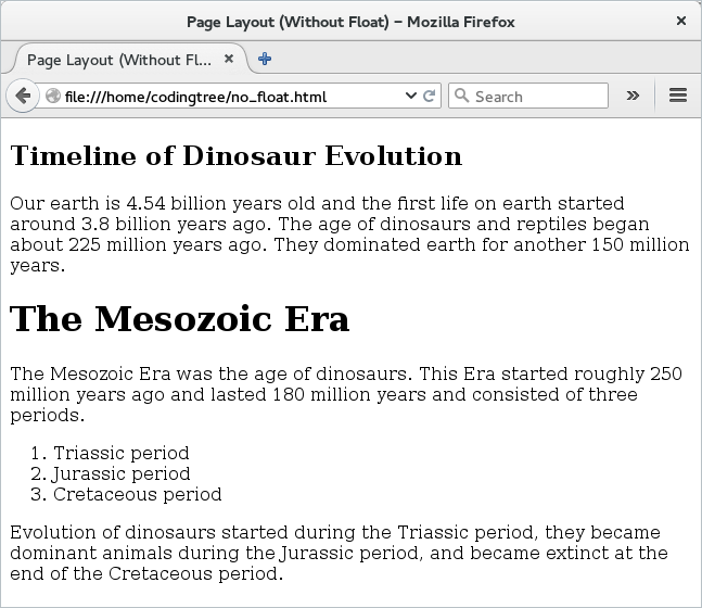
Figure: Page layout without float
So, to make it float, we reuse the above HTML file and this time add CSS to it. Here is the updated file -- the file is mostly same as before and the only thing that has changed is the addition of the link element to include the CSS file ("layout.css").
 <!doctype html>
 <html>
 <head>
     <title> Page Layout (With Float) </title>
     <link type="text/css" rel="stylesheet" href="layout.css">
 </head>

 <body>
 <div id="id_evolution">
 <h2>Timeline of Dinosaur Evolution</h2>
 <p> Our earth is 4.54 billion years old and the first life on earth started around 3.8
 billion years ago. The age of dinosaurs and reptiles began about 225 million years
 ago. They dominated earth for another 150 million years. </p>
 </div>

 <div id="id_mesozoic">
 <h1> The Mesozoic Era </h1>
 <p> The Mesozoic Era was the age of dinosaurs. This Era started roughly 250 million years
 ago and lasted 180 million years and consisted of three periods. </p>
     <ol>
     <li> Triassic period </li>
     <li> Jurassic period </li>
     <li> Cretaceous period </li>
     </ol>

 <p> Evolution of dinosaurs started during the Triassic period, they became dominant animals
 during the Jurassic period, and became extinct at the end of the Cretaceous period. </p>
 </body>
 </html>
Next, we provide the "layout.css" CSS file. This file assigns properties to both of the div by using their CSS id. There are two things worth noting here. First, it creates a two-column layout by assigning different width to the two blocks -- the first block (with ID as #id_evolution) takes the 25% of the width of the browser and the second column takes up the rest 75% of the width. Second, we assign a float value of "right" to the #id_evolution and this makes this block float to the extreme right. Since we have kept its width to 25%, this would now occupy the right hand side 25% and the other block (with ID as #id_mesozoic) would sit on the left and occupy the 75% of the window width.
 #id_evolution {
     width: 25%;
     border-style: solid;
     border-width: thin;
     padding: 10px;
     border-radius: 10px;
     float: right;
 }

 #id_mesozoic{
     width: 75%;
     padding:10px;
 }
Now, let us load the above page. With that, we would see the magic! The first div is now floating on the right hand side and occupies 25% of the width. The other div (which is the main div) is now on the left. Here is the output:
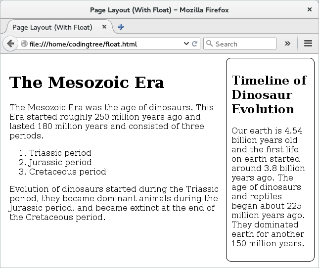
Figure: Page layout With float
Using clear
Float and clear work closely. When we use the float property for an element, the browsers places the box of that element accordingly. However, if there is an element that is underneath (basically, an element that the browser would keep next in the layout) then the floating element can overlap with the underlying element. To avoid such cases, we can use the clear property for the underlying element. This property instructs the browser to add enough space above the underlying element in the layout so that it can avoid overlapping with the earlier floating element.
Let us see some more details on the clear property.
Usage: clear: [left | right | both | none] | inherit;
Description: We should use this property to make room for an element (or elements) that is (are) prior to the current element and has (have) the float property set. The inherit value may not be supported in all browsers.
Example: Specifying "clear: left" would move the current element so that it does not overlap with an element that is floating (immediately above the element) and is floating on the left.
Example: Specifying "clear: right" would move the current element so that it does not overlap with an element that is floating (immediately above the element) and is floating on the right.
You might be thinking that do we need to add the clear property to elements that are above the floating element. Well, this is not needed since the browser does a layout from top to bottom and from left to right. So, if an element at the top needs some amount of space, then the browser would have already allocated that much space. So, if we add a float, then we need to add the clear property to the element that follows the floating element.
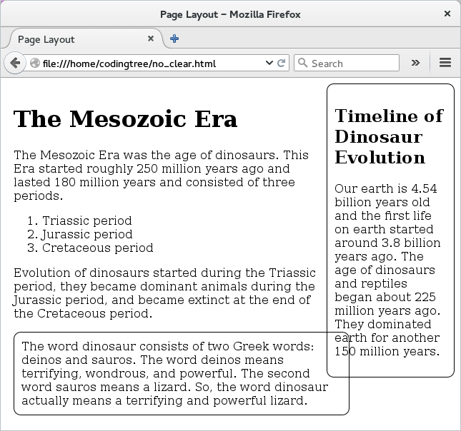
To help understand the problem better, let us see what happens if we add another <div> to our earlier example. Here is our updated HTML file (we call it "clear.html") with a new div that is added at the bottom of the page.
 <!doctype html>
 <html>
 <head>
     <title> Page Layout </title>
     <link type="text/css" rel="stylesheet" href="layout2.css">
 </head>

 <body>
 <div id="id_evolution">
 <h2>Timeline of Dinosaur Evolution</h2>
 <p> Our earth is 4.54 billion years old and the first life on earth started around 3.8
 billion years ago. The age of dinosaurs and reptiles began about 225 million years
 ago. They dominated earth for another 150 million years. </p>
 </div>

 <div id="id_mesozoic">
 <h1> The Mesozoic Era </h1>
 <p> The Mesozoic Era was the age of dinosaurs. This Era started roughly 250 million years
 ago and lasted 180 million years and consisted of three periods. </p>
     <ol>
     <li> Triassic period </li>
     <li> Jurassic period </li>
     <li> Cretaceous period </li>
     </ol>

 <p> Evolution of dinosaurs started during the Triassic period, they became dominant animals
 during the Jurassic period, and became extinct at the end of the Cretaceous period. </p>

 <div id="id_misc">
 The word dinosaur consists of two Greek words: deinos and sauros. The word deinos means
 terrifying, wondrous, and powerful. The second word sauros means a lizard. So, the word
 dinosaur actually means a terrifying and powerful lizard.
 </div>
 </body>
 </html>
And here is the updated "layout.css" file. The only difference is that we have added CSS rule for the newly added div: #id_misc. The rule basically specifies a border, a border-radius, and padding. Other than that, everything is same as before.
 #id_evolution {
     width: 25%;
     border-style: solid;
     border-width: thin;
     padding: 10px;
     border-radius: 10px;
     float: right;
 }

 #id_mesozoic{
     width: 75%;
     padding:10px;
 }

 #id_misc{
     border-style: solid;
     border-width: thin;
     border-radius: 10px;
     padding:10px;
 }
If we load the above page, then we would see that the two boxes now overlap with each other. Not something that we would like!
Figure: Page layout With float (No clear)
So to fix the above overlap problem, we can take the help of our newly learned property: float. We simply make the float property for the newly added as "both". What this means is that when the browser adds the last div block, it would add some extra space so that it avoids overlapping with the previous blocks on either side. For this example, we could have just gotten away by keeping the value of clear to be "right".
 #id_evolution {
     width: 25%;
     border-style: solid;
     border-width: thin;
     padding: 10px;
     border-radius: 10px;
     float: right;
 }

 #id_mesozoic{
     width: 75%;
     padding:10px;
 }

 #id_misc{
     border-style: solid;
     border-width: thin;
     border-radius: 10px;
     padding:10px;
     clear: both;
 }
And, now when we load the above HTML page, we would see that we do not have any overlap any more. We can see that the browser adds some space before adding the #id_misc block so that it clears any element on the left or right (in this case, right!). Here is the output.
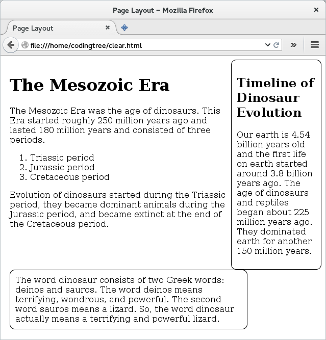
Figure: Page layout With float (With clear)