Box Model: Border Properties
The border is a line (with width) that surrounds the padding area and content sits inside the padding. The inside of the border touches the padding and the outside of the the border touches the margin. The border itself has four-sides: top, right, bottom, and left. We show that in the following picture.
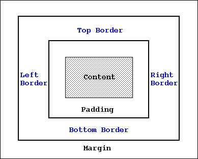
Figure: Border in the Box Model
We look at some of the important properties that add style to the border: border-width, border-style, border-color, and border-radius. We also discuss another property, namely the "border" property, that combines border width, style, and color properties. For all of these properties, we can specify the value as "inherit" and in that case, they would inherit their value is from the parent element.
So, let's get started and list the above properties first!
The first property that we would look is the border-width. A border is basically a line and the border-width allows us to set the value of the width.
Usage: border-width: [thin | medium | thick | <width_in_px>] {1,4} | inherit
Description: Specifies the width of the border. When added, the value applies to all four sides of the border; default value is "medium". Values like "thin", "medium", and "thick" are preset value in terms of pixels. Does not support width value in percentage. We can also specify more than one value. If we provide two values, then the first value applies to the top/bottom borders and the second value applies to left/right borders. If we provide three values, then the first value applies to the top border, the second value applies to the left/right borders, and the third values apply to the bottom border. If we specify all four, then they apply to the top, right, bottom, and left, in the order of first, second, third, and fourth values, respectively. For border-width to work, the border-style should NOT be set to "none".
Example: Specifying "border-width: thick" means a border with a thick line.
Example: Specifying "border-width: 8px" means a border with a thickness of 8px width.
The second property specifies the style of the border. Like any other lines, we can specify the line style to be solid, dotted, double (double meaning there would be two lines!), etc. This is a rather important border property -- if this is set to "none", then other border properties would not even show up!
Usage: border-style: [solid | dotted | dashed | double | groove | ridge | none | inset | outset | hidden] {1,4} | inherit
Description: Set the style of the border to be one of the above values. If we set it to none, then we would have no border at all. We can also specify more than one value. If we provide two values, then the first value applies to the top/bottom border style and the second value applies to left/right borders. If we provide three values, then the first value applies to the top border, the second value applies to the left/right borders, and the third values apply to the bottom border. If we specify all four, then they apply to the top, right, bottom, and left, in the order of first, second, third, and fourth values, respectively. Default value is "none"!
Example: Specifying "border-style: solid" means we have a border that will have a solid line.
Example: Specifying "border-style: double" means we have a border that will have two solid lines.
The next property allows us to specify the color of the border. We can specify color as text (like "red", "blue", etc) or as hex RGB (Red, Green, Blue) value (like #0000FF, #FF0000, etc).
Usage: border-color: [<color> | transparent] {1,4} | inherit
Description: Sets the color of the border. To be more precise, it sets the color of the (border) line. We can specify the value of color in both text (as in "blue", "red", etc) or the RGB notation as #0000FF, #FF0000, etc. We can also specify the border-color to be "transparent" -- you can still provide border-width to the border. However, because the border-color is transparent, the width would not be seen! We can also specify more than one value. If we provide two values, then the first value applies to the top/bottom border color and the second value applies to left/right border colors. If we provide three values, then the first value applies to the top border, the second value applies to the left/right borders, and the third values apply to the bottom border. If we specify all four, then they apply to the top, right, bottom, and left, in the order of first, second, third, and fourth values, respectively.
Example: Specifying "border-color: blue" means we have a border will have a line of blue color.
Example: Specifying "border-color: #0000FF" would specify the border-color to #0000FF, which BTW, is also blue.
Our first example shows the usage of two border-properties: border-width, border-style, and border-color. The example (provided below) has two paragraph elements. We keep the border-style to be solid and double for these two paragraph elements.
 <!doctype html>
 <html>
 <head>
     <title> Learning CSS: Box Borders </title>
     <link type="text/css" rel="stylesheet" href="border.css">
 </head>

 <body>
 <p id="id_jurassic">
 Jurassic period was one of the three main periods of Mesozoic Era. Jurassic
 period is further divided into three sub-periods: early Jurassic, middle
 Jurassic, and late Jurassic. This period was a significant period for dinosaurs
 and other reptiles. They became the most dominant and the most diverse vertebrae
 during this period.
 </p>

 <p id="id_reptiles">
 Reptiles ruled the earth during this period, Dinosaurs were the most
 dominant race on the land. Notable among them were the Theropods -- the dinosaurs
 that hunted on two legs and were mostly carnivores. Reptiles were also the most
 dominant race in the ocean. Two such reptiles were Plesiosaurs and Ichthyosaurs.
 And when it came to sky, the supreme flying creature was once again another
 reptile: Pterosaurs.
 </p>
 </body>
 </html>
And here is the "border.css" that modifies the border-width, border-style and border-color properties. Please note that we need to set the border-style; otherwise, the default value of the border-style is "none" and that would mean we would not be able to see the border, let alone the value set by border-width property!
 #id_jurassic {
     border-width: thick;
     border-style: solid;
     border-color: blue;
 }

 #id_reptiles {
     border-width: 8px;
     border-style: double;
     border-color: green;
 }
If we load the above HTML page, here is what we would see:
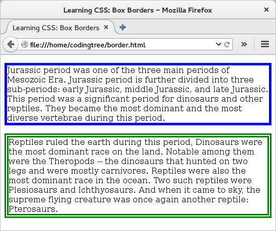
Figure: Border -- Width, Style, and Color
Now, CSS provides a shorthand to combine the above three properties (width, style, and color); that is the border property. With this, we can specify the value of the width, style, and color (in that order) without any commas in between. It is okay if we do not provide all three -- the one (or the ones) that we do not provide would assume the default value.
Usage: border: [<values_width> | <values_style> | <values_color>] | inherit
Description: A shorthand to neatly tuck the following three properties (in order): border-width, border-style, and border-color. See the API border-width for the values of width, border-style for values of style, and border-color for values of color. It is allowed to not provide all three properties. It does not add border-radius.
Example: Specifying "border: thick solid blue" means we have a border that has "thick" width, is solid in style, and is blue in color.
Example: Specifying "border: thick solid" means we have a border that has "thick" width and is solid in style. Since we do not specify the color, it would be the default value.
If we want, we can use the "border" property to combine together the border-width, border-style, and border-color into one. Here is the updated "border.css" file from our earlier example. The output would be same as before and hence, we omit it.
 #id_jurassic {
     border: thick solid blue;
 }

 #id_reptiles {
     border: 8px double green;
 }
Border Radius
By default, the boxes have sharp corner (like a lot of the boxes out there!). However, CSS allows us to make these edges more round and it does so by using the property of "border-radius". We can use this property to specify the radius value that would determine the roundness of the edges.
Usage: border-radius: [<length_value> | <percentage>] {1,4} [/ [<length> | <percentage>] {1,4} | inherit
Description: Specifies the radius of the border corners. To be more precise, the radius specifies the quarter of an ellipse that replaces the square corners. For each corner, it can accept two values. The first value is the horizontal radius of the ellipse. The second value is the vertical radius of the ellipse. If we specify a single value, then both the horizontal and the vertical radii are same and in that case, the quarter ellipse becomes a quarter circle. If we want to have different values for each corners, then we can specify up to 4 values, followed by a "/" and then another 4 values. Does not accept any negative values.
Example: Specifying "border-radius: 10px" would mean that both horizontal radius and vertical radius would be 10px and this would be applied to all corners.
Example: Specifying "border-radius: 10px/20px" would mean that the horizontal radius would be 10px and the vertical radius would be 20px and this would be applied to all corners.
Example: We can specify up to 8 values, two for each corner. Thus, "border-radius: 10px 11px 12px 13px/20px 21px 22px 23px" would mean that we have 10px/20px for top-left corner, 11px/21px for top-right corner, 12px/22px for bottom-right corner, and 13px/23px for bottom-left corner.
For the above property, if you find specifying 8 values for the border-radius a little confusing, then I don't blame you! Usually, a single value is all you would need since that would keep both horizontal and vertical radii to be same and would keep the value same for all corners. Also, you might find it simpler to specify these values individually using border-top-left-radius, border-top-right-radius, border-bottom-right-radius, and border-bottom-left-radius. We describe these four properties a little later on this page.
Our next example focuses on the border-radius property. For that, we reuse the same HTML file as before and merely update the CSS file ("border.css"). This time, we keep the border-width to be 8px, border-style to be solid, and border-color to be green for both paragraph boxes, provide different values for border-radius. In this example, for #id_jurassic element, we provide values for both horizontal and vertical radii. For the #id_reptiles element, we specify all 4 pairs, one for each corner. The first set is for the top-left corner, the second set is for top-right corner, and so on. If you wanted to have a single value (which would happen in most of the cases!), you could just keep it as "border-radius: 20px" and this would apply to all four corners.
Here is the updated "border.css" CSS file.
 #id_jurassic {
     border-style: solid;
     border-width: 8px;
     border-color: green;
     border-radius: 20px/40px;
 }

 #id_reptiles {
     border-style: solid;
     border-width: 8px;
     border-color: green;
     border-radius: 10px 30px 50px 70px/10px 30px 50px 70px;
 }
If we reload the above HTML page after changing the CSS file, we would see that now we have corners for the two borders. Note that the second paragraph box has different radii value pertaining to different corners -- the order being top-left, top-right, bottom-right, and bottom-left.
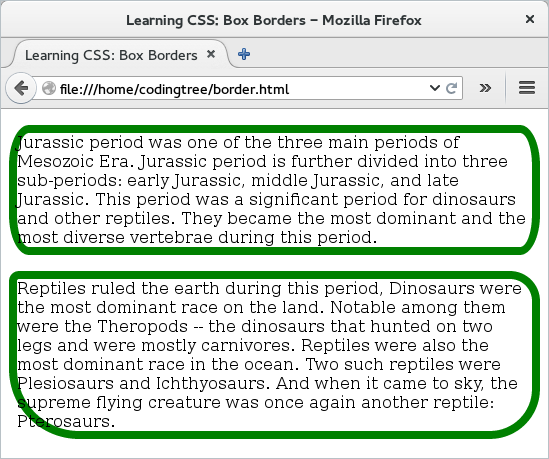
Figure: Border Radius
More Specific Properties
All of the above border-related properties also come in more specific versions. For the sake of completeness, we provide them here. If you are dealing with a case where you have to specify individual values to different borders (top, right, bottom, or left), then you would need to specify them individually. However, if you do not need to bother about individual sides, then you should just stick with the less-specific versions that are described in the earlier section -- that would be a simpler design.
Let us begin with the four variations for the border-width property. Like the case of the border-width property, all of these accept the same kind of values: "thin | medium | thick | <length> | inherit".
Property: border-right-width
Property: border-bottom-width
Property: border-left-width
Next, we provide the four specific variants of border-style property. Similar to the border-style property, the following four accept the same set of values: "solid | dotted | dashed | double | groove | ridge | none | inset | outset | hidden". Please look at the border-style property above since the same behavior would apply here as well.
Property: border-right-style
Property: border-bottom-style
Property: border-left-style
Let us next provide the four variants of the border-color. Like the case of the border-color property, all of these accept values as: "<color> | transparent | inherit". The difference here is that we can specify color to individual borders.
Property: border-right-color
Property: border-bottom-color
Property: border-left-color
Next, we also have specific variants for the border-radius property. Unlike the border-radius property, the following property take only two sets of input: "<length1> <length2>". The two input are the two radii associated with each corner: the horizontal radius and the vertical radius. Thus, "border-top-left-radius: 5px 10px" would assign the horizontal radius of the top left corner as 5px and the vertical radius of the same corner as 10px. If we want simplicity, then we can still specify a single value and that would apply for both horizontal and vertical radii for the selected corner.
Property: border-top-right-radius
Property: border-bottom-right-radius
Property: border-bottom-left-radius
Property: border-right
Property: border-bottom
Property: border-left